|
I viewed the video that Taehyeong posted from South Korea. Seeing this video reminds me of the power of the web in terms of connecting people for many reasons, be they social or educational. His example of a social network map was interesting. Social network analysis isn't an entirely new concept to me, but seeing it mapped the way he did got me thinking. It blows my mind to think about this type of map being applied to the users in a very large network with millions upon millions of interactions, such as Facebook. It got me thinking a lot so I did a little research and found a blog post with a good example of a personal map and that led me to a tutorial that outlined how I could get my own personal map using Gephi (basic visualization software). In order to use it it you have to first access the data file from Facebook. Even though the steps were pretty complicated, I decided to try my hand at it (I’m really good at following directions and using forums and other info outlines to solve digital problems) but unfortunately could not get past the first step which was to use the Netvizz v1.44 Facebook app to download the data file that I would need to complete the other steps because every time I tried to install and deploy the app I keep getting the same error message over and over. “App not yet installed. Install the app.” The post was written in 2010 so I ~suspect~ that Netvizz may have changed since then. Not to be deterred I tried another route that started with the MyFnetwork Facebook app. Well, upon further investigation that app stopped allowing users to download their data files in 2012. Disappointing because I was unable to locate another source to get this data file. Turns out you used to also be able to create a similar map with LinkedIn if you had more than 50 connections and profile that is at least 75% complete. But that post was written in 2011 and it no longer allows you to pull that data, either. While I was unsuccessful in creating a map with one of these tools, I think I will keep looking and see if it’s possible with other platforms because it is a fascinating subject. You would think that these types of tools would evolve and become better, not go under with no alternatives. Shouldn’t more people be wanting to mine their social network data, not less? As the use of social media grows and users become more technologically proficient, it would seem that the demand for such a tool would increase. The uses for such a way to visualize your social media interactions are limitless. I could see this being a highly engaging way to teach students the basics of manipulating complex data sets. Can you think of any other ways that this might be useful in education? Select 'Read More' below to see a few examples of the kinds of maps I was trying to recreate using my own data. They are really pretty and proved to only be a tease that sent me down a rabbit hole. Do you have any tools you can suggest that can lead to these types of data visualizations? Chad Renando's Facebook Map from Sideways Thoughts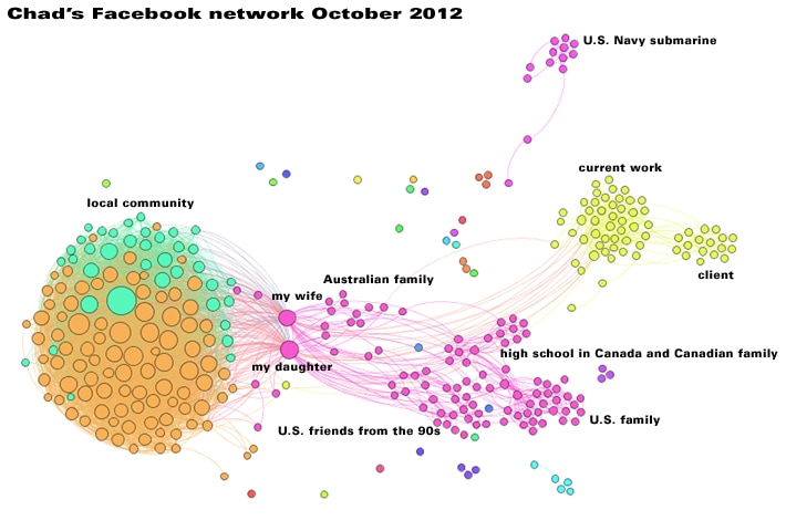 Olivier Duquesne's LinkedIn Map from Flickr 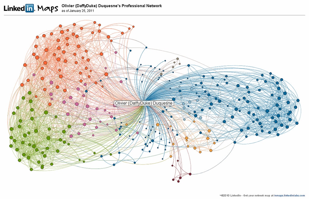
2 Comments
Vanessa
7/6/2017 08:38:13 pm
You tried Gephi? Hardcore! :)
Cathryn
7/7/2017 06:54:06 pm
Wow! This is so fascinating. Ok. I'm really wanting to try Gephi just to see what turns up. It's so funny, but before this class I didn't really care or even think about this stuff before. I'm beginning to understand how important it is. Leave a Reply. |
About this blogA simple exploration of Web 2.0 and social media and their applications to education; an attempt to learn how prosumers are shaping the internet and how educators can capitalize on it. ArchivesAbout MeNature grrl; loves dogs, books, traveling, clouds, technology, thrifting, break beats and good beer. 
|
 RSS Feed
